I chose this photo because it is very emotional and the image tells the story extremely well, despite the sensitive subject.
I found this photo in the Returning Veterans, Coming Home category.
This image came in 1st place.
This image caught my eye because it was in black and white and the lines that lead to the woman.
This subject of the image weighed in the judges mind very heavily because the photo showed intense emotion.
I think that the actions of the photographer were unique because the photographer had to get close to the woman and place her in the center of the photo as well as getting the photo from an angle so that not all of the stones were in focus, but the woman was in focus.
I chose this photo because the light of the fire framed the woman, and the contrast created a unique feel.
I found this photo in the Photographer of the Year category.
This image came in 2nd place.
This image caught my eye because the contrast between the fire and the woman gave the image an eerie feel.
The subject of the image weighed in the judges mind somewhat heavily because the photo showed the occurring devastation of the woman's life, and most likely other lives.
I think that the actions of the photographer were unique because the photographer had to place the woman in the left side of the image and had to find the right angle to make sure that the fire illuminated very little of the woman's body.
I chose this photo because the background is blurred and the subject is very pronounced and conveys strong emotions of sorrow and tragedy.
I found this photo in the Domestic News Single category.
This image came in 1st place.
This image caught my eye because the background is blurred and image was well balanced.
The subject of the image weighed in the judges mind heavily because the photo shows intense sorrow and gratefulness.
I think that the actions of the photographer were unique because the photographer most likely had to push and shove his way toward the grieving/thankful family as shown by the heads in the lower left hand corner. The photographer most likely also had to position the camera above his head to capture the man's face in its entirety.
Tuesday, September 29, 2015
Unusual and Interesting Photographs
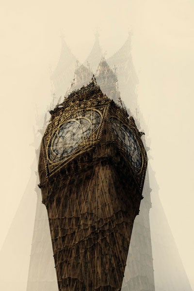
My first reaction to Ruhm's work is wondering how much thought and time was put into taking these pictures, my second reaction was admiration at the quality of the photographs.
I think that Ruhm achieved these photos by taking three pictures of the subject from different angles, possibly using a filter, and later layered them together.
I feel like the Louisiana State Capital building would be a great building to photograph in a similar way. However, since the building is located in Baton Rouge, Louisiana, then it would not be a feasible subject. Another great pulsing to photograph in this way would be the UT Tower, located downtown Austin. I would easily be able to photograph this building.
My favorite photograph:
Friday, September 25, 2015
Academics & Community Service Photographs
My favorite photo is the picture of the math teacher using an old projector to teach her student. I picked this photo because it is the most reverent to my life and it shows how far technology has come since the image was taken. Some of the rules of photography that are evident in the photo are rule of thirds and lines.
I could take similar pictures by photographing during brain breaks that some teachers take, during monologues that theatre students present, and during a lab in a science class. I would like to take pictures in the yearbook room, the theatre room, and during color guard practice. As the photographer, I will get amazing photographs like the ones I viewed today by utilizing all of the angles possible, using different zooms, and following some of the rules of photography.
I could take similar pictures by photographing during brain breaks that some teachers take, during monologues that theatre students present, and during a lab in a science class. I would like to take pictures in the yearbook room, the theatre room, and during color guard practice. As the photographer, I will get amazing photographs like the ones I viewed today by utilizing all of the angles possible, using different zooms, and following some of the rules of photography.
Filling the Frame
This photo fills the frame most effectively because there is very little unused space, and the unused space adds to the old bookish effect of the image. The student, surrounded by stacked textbooks, is immersed in a book that is propped up on the stacked textbooks. While this image doesn't show much action, it gives some insight into the student's life, which I find interesting. In addition, the photo's edges fade to black helping to fill the frame.
Action and Emotion
This photo demonstrates the most action and emotion because the atmosphere of the photo is upbeat and the students are fascinated by the experiment and they are having fun. The emotion of the image is curious and happy as shown though the students expressions and how all of the students are looking at the lab. The action of the photo is shown though the picture being of a lab where all but three students are participating in the lab and all are observing the experiment.
The Story
This photograph tells the best story because the image shows a story though the bowing of the students' heads and the fact that all of the students are holding hands around a flagpole. There are several possible stories that could be associated with this image. One possible story is that a fellow student was injured or possibly died in an accident and the student body is praying for the injured student or the deceased student's family and friends. Another possible story is that somebody important to the community died and the student body is praying for the community and the person's family. A third possible story is that this is a religious group that meets before/after school for a religious ceremony.
Wednesday, September 23, 2015
Photo Manipulation and Ethics II
In my opinion, the least ethical photo in the article Photo Ethics is the photograph of Oprah Winfrey, whose head was photoshopped onto Ann Margret's body. I find this disturbing because the photo misleads the public and insinuates that either Ann Margret's face is too unattractive or Oprah Winfrey's body is too unattractive. The editing done in this photo is unacceptable and it should not have been created.
I believe that the least objectionable photo in the same article is the photograph where National Geographic moved two pyramids closer together in order to fit them both on the cover. While this is still unethical, it is the photo that is the closest to acceptable. I find this the most ethical of the bunch because the only motivation in the manipulation is to fit the pyramids on the cover, it was done without malevolent or cruel intentions.
Photo Manipulation and Ethics
There have been many instances of photo manipulation in the Middle East, a serious offense in the United States, however, this crime often goes unpunished in the Middle East . If a newspaper in America were to publish a manipulated photograph, the photographer would be fired and lose credibility as manipulating images is considered unethical because it shows the public untrue images.
Ethics in the age of digital manipulation
In my opinion, photo manipulation is unethical because it shows the public an untrue image and could taint or sway a person's opinion of a topic. However, I believe that small edits are acceptable when the photos will be used for personal use only and when all participants give consent for the editing to take place.
Monday, September 21, 2015
Great Black and White Photographers II
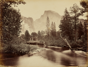
Carleton Watkins was born in 1829 in Oneonta, New York to John and Julia Watkins. In 1851 Watkins moved to San Fransisco during the California Gold Rush. Before working in photographs, Watkins originally delivered supplies to mining operations, was a store clerk at a bookstore. The store at which Watkins worked was near a photography studio belonging to Robert Vance. Watkins was introduced to photography when one of Vance's employees left suddenly, giving the opportunity to look after the studio. After learning the art, Watkins photographed the Pacific coast during the 1860's and 1870's, capturing the landscape in startling ways using stereoscopic and mammoth-plate formats. In 1865 the California State Geological Survey chose Watkins to be the official photographer.
Watkins did not publish any books, however the photographer opened the Yosemite Art Gallery where he displayed several Pacific Coast landscapes. Unfortunately Watkins, a terrible businessman, lost his gallery to J.J. Cook. In 1906, the gallery was lost in the San Francisco earthquake and fire.
Watkins's medical decline began in the 1890's with loss of sight, which lead to the inability to pay rent. In 1909, Watkins was declared incompetent and his daughter cared for him. In 1910, he was committed to the Napa State Hospital for the Insane, and he died in 1916. Watkins's legacy lives on in his stunning pictures of Yosemite.
The Half Dome
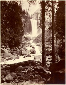
Vernal Fall
Sources:
Thursday, September 17, 2015
Prompt Shoot Refletion
Some of the challenges I faced with getting the photos for the prompt shoot, were figuring out what to take pictures of, and how to interpret some of the more abstract prompts.
One of the technical aspects I found myself thinking about the most during the shoot was what "rule" I should use for what picture, and what would the best angle be to get the picture.
If I could do the assignment again, I would do things differently by take more pictures of everything. I would use several angles for every subject and I would take several pictures from each angle with slight adjustments. I would chose more subjects and use more "rules".
If I did the assignment again, I would still be somewhat picky about what my subject would be, and I would still take more photos of one prompt than necessary, in order to have more options.
I would definitely shoot some of the prompts again, mostly Bowie and Happy, because they have positive connotations to me.
http://ramisphotojournalismblog.blogspot.com/2015/09/1st-composition-shoot.html
In this blog are several good photos. The first of these is the Square photo, which shows an excellent example of lines. The second great photo is Happy as it shows amazing balance. However, one improvement I would recommend would be to the Metal photo, the only thing I would change would be the angle, as a something is visible in the upper right hand corner. The photos Rami has taken are awesome and show excellent understanding of the rules of composition.
Prompt Shoot: Merger
Prompt Shoot: Metal
In this photo, I used the rule of lines, as shown when the lines of the grey roof lead to the red roof, whose lines lead to the next red room, and so on.
Prompt Shoot: Square
In this photo, I used framing and lines to lead to and frame the rectangle scene in the center of the image. The pillars frame the intended subject and they also create a line for the eyes to follow to the subject.
Prompt Shoot: Bowie
In this photo, I used lines, as shown when the roof leads to the windows and in return the sun gives the photo a more dramatic feel.
Prompt Shoot: Happy
In this photo I used the rule of thirds, as shown by the pink rose in the bottom left hand corner of the image.
Friday, September 11, 2015
Avoiding Mergers
This is an example of what happens when the photographer doesn't avoid mergers. Because the pink lady's head has been cut off, it gives the picture an incomplete feel and diminishes the emotions of the image.
Framing
Balance
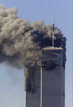
This picture shows vertical balance as shown though the amount of damage on either side of the picture is equal. This also shows horizontal balance as the falling debris balances out the smog of the air.
Lines
This image is an example of lines because the vertical lines of the building lead to the diagonal hole of made by the plane. The vertical lines lead the eyes directly to the dramatic diagonal damage of the plane.
Rule of Thirds
This picture is an excellent example of rule of thirds because the people, the main focus, are not in the center, and instead they are in the corners of the image. This adds to the eerie effect because it shows more of the ominous fog.
Simplicity
This picture is an example of simplicity because the subject is obvious and the background doesn't distract form the horrific scene. Because of the simplicity of the photo, the towers are the main focus, instead of other objects or people.
Wednesday, September 9, 2015
The Camera
The camera obscura, Latin for dark room, is an optical effect. The effect is achieved like this: inside pitch black room, a tiny hole is made on one wall. Through this hole, light is focused and the scene on the other side of the hold is projected upside down on the wall inside the room.
In the 17th century, Isaac Newton and Christian Huygens completed the understanding of optics and the process making high quality lenses for glasses.
In 1827, Joseph Niepce invented an important part of the first modern camera, the film.
Modern digital cameras work somewhat similarly to Niepce's camera. Much like the first modern camera, light enters the lens and exposes the film, resulting in a photograph.
Digital cameras have replaced the old-fashioned plastic film of the past and capture images with an electronic sensor called a CCD, the photographs are then stored on a reusable computer memory device.
The difference between the auto and program modes is that the auto mode controls flash and exposure, and the program mode allows the photographer to control flash and some other settings.
Portrait mode is used to blur out the background, the camera achieves this by using the fastest available lens setting.
Sports mode is used to capture a moving object by using the highest shutter speed possible.
A photographer should half-press the button in order to allow the camera some extra time to focus.
The disabled flash symbol, used when flash isn't needed, is a zig-zag arrow surrounded by a circle with a line though it.
The auto flash symbol, when the camera uses the amount of flash it deems necessary, is a zig-zag arrow with the word auto next to it.
If a photo has too much light, the picture is washed out.
If a photo has too little light, the picture is too dark to see.
A stop is a term used to represent a change in the brightness of a light.
If two suns are used, instead of one, then the stop is +1 Stop.
If four suns are used, instead of two, then the stop is +2 Stops.
The longer shutter speeds mean that more light enters the camera.
The shorter shutter speeds mean that less light enters the camera.
The aperture controls how big the opening is that allows light to enter the camera.
When adjusting the aperture, the smaller the F-Stop number is, the larger the opening.
Subscribe to:
Posts (Atom)


